
Large lantern displays can present different visual priorities before and after illumination. In daylight or while unlit, visitors can more easily read physical form, surface color, visible detail, and the display’s relationship to its surroundings. After dark, illuminated color relationships, contrast, layers, and focal points may become more prominent.
Venues that receive visitors during the day, at dusk, or before illumination should give the unlit view explicit attention. Projects seen only after full darkness may give the nighttime view greater priority.
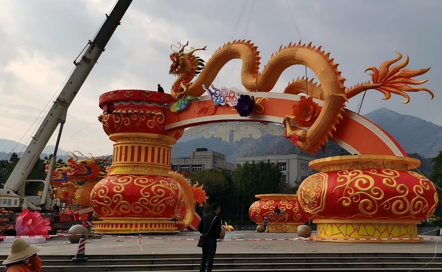
When Does Day-and-Night Appearance Matter to an Attraction?
Day-and-night appearance matters when a large lantern display remains visible before illumination. Parks, zoos, botanical gardens, cultural attractions, theme parks, and public venues may receive visitors while daylight still defines the background. Then the silhouette, surface colors, details, and relationship to vegetation, buildings, sky, or ground are already part of the scene.
If the display is shown only after complete darkness, the nighttime view can carry more visual weight. The two states need not receive equal emphasis. First clarify when visitors will see the installation and what role each state should play. For broader theme and scene exploration, see custom lantern display options.
What Can Be Read Before the Lanterns Are Illuminated?
Before illumination, a large lantern display is read as a physical form in a real setting. Natural light can reveal its outline, posture, overlap, surface color, visible detail, and separation from the background.
Form and Silhouette
The overall outline often carries the first readable idea. The pose of a figure, the curve of a plant form, and spaces between overlapping elements may remain visible from a general view. A clear silhouette can support recognition.
Surface Color and Visible Detail
Daylight can reveal surface colors and details that may receive less attention after dark. Color blocks, pattern edges, facial features, and transitions between visible parts can shape the daytime reading. In our project discussions, the unlit review often centers on the overall visual result: whether the colors and shape work together, whether the display looks balanced, whether seams stand out, and whether the surface covering shows wrinkles where it has not been stretched smooth.
Relationship to the Daytime Background
Sky, vegetation, buildings, paving, and ground are more visible before dark and participate more strongly in the composition. A subject may read clearly against one background and less clearly against another. Compare the subject against the actual daytime background, especially where sky, vegetation, buildings, paving, or ground may compete with its outline.
What Becomes More Prominent After Illumination?
After illumination, the visual hierarchy may shift. Light-emitting areas can become more noticeable, while darkness reduces competition from some background elements. Color relationships, contrast, illuminated layers, and selected focal points may then carry more attention. In our project reviews, the illuminated state is also where we look at whether light appears evenly distributed, whether localized bright or dark areas distract, and how the outline and edge-light accents read.

Illuminated Color Relationships
Illuminated colors may relate differently from colors visible during the day. Some areas may become dominant while others act as accents. The night view need not reproduce daytime balance exactly.
Contrast, Layers, and Focal Points
Against a darker background, bright areas, repeated forms, and overlapping illuminated elements may create a different sense of depth. Attention may move to a central figure, illuminated edge, or brighter group. The venue can decide which subject or group should lead the night view.
Day and Night Are Two Views, Not Two Identical Targets
A useful comparison asks the same visual questions in both states.
| Visual question | Before illumination | After illumination |
|---|---|---|
| What is noticed first? | Overall shape, color relationships, visible finish, and detail | Illuminated color, light distribution, contrast, and focal points |
| How does the background participate? | Sky, vegetation, buildings, and ground are more visible | A darker setting may make illuminated subjects more prominent |
| Where do layers come from? | Physical form, overlap, surface treatment, and visible seams or wrinkles | Relationships between brighter, darker, and illuminated areas, including the outline and edge-light accents |
| What should the venue clarify? | Whether color, shape, and finish need close daytime review | Which subjects should lead and which lighting details must be observed after illumination |
The balance depends on when the venue is open and what each view is expected to communicate. A daytime-visible attraction may need both states to carry deliberate roles. A night-only program may reasonably place more emphasis on the illuminated view.
In our project work, displays that remain visible through both periods usually receive closer daytime finish review because color balance, seams, and surface wrinkles can be more apparent before illumination. Some of those details may become less noticeable after dark, while light distribution, localized bright or dark areas, the outline, and edge-light accents become easier to judge. The two states therefore call for attention to different visible qualities.
What Should the Venue Clarify in the First Visual Conversation?
The first discussion can stay limited to three day-and-night questions:
- When will visitors see the display: during daylight, at dusk, after dark, or across more than one period?
- What visual role should the unlit view and illuminated view each play?
- What daytime reference photo covers each display area, and is there one nighttime overview that shows the wider setting and main background?
In our project discussions, daytime images usually provide the detailed reference for each area and may be darkened to prepare a visual rendering. One nighttime panorama can provide overall context without matching the same level of detail. The rendering supports the visual conversation; it does not establish the actual illuminated result.
These inputs define the visual question without asking the venue to complete a professional design first. If the project is ready to move into the wider venue brief, visual hierarchy, rendering, review, and handoff stages, continue with the full custom lantern festival design process.
Where Visual Review Ends
This comparison is limited to what is visibly readable before and after illumination. Structural, electrical, photometric, fire, public-safety, material, installation, permit, and compliance questions require project-specific review by the venue and appropriate qualified parties.
Discuss How Your Display Will Be Seen Before and After Dark
Share the venue type, when the display will be visible, the visual role expected before and after illumination, and any available site photographs or references. A finished professional design is not required before the first conversation. Discuss your venue and visual priorities.
Post time: Oct-05-2026


