
For many lantern festival projects, the hardest moment does not come on opening night. It comes much earlier, when the client is sitting in front of two similar proposals.
The budget looks close. The renderings both seem acceptable. The number of lantern groups appears similar. And the easiest conclusion is usually this: they probably will not be that different.
But the real difference often becomes visible only on the night the lights turn on.
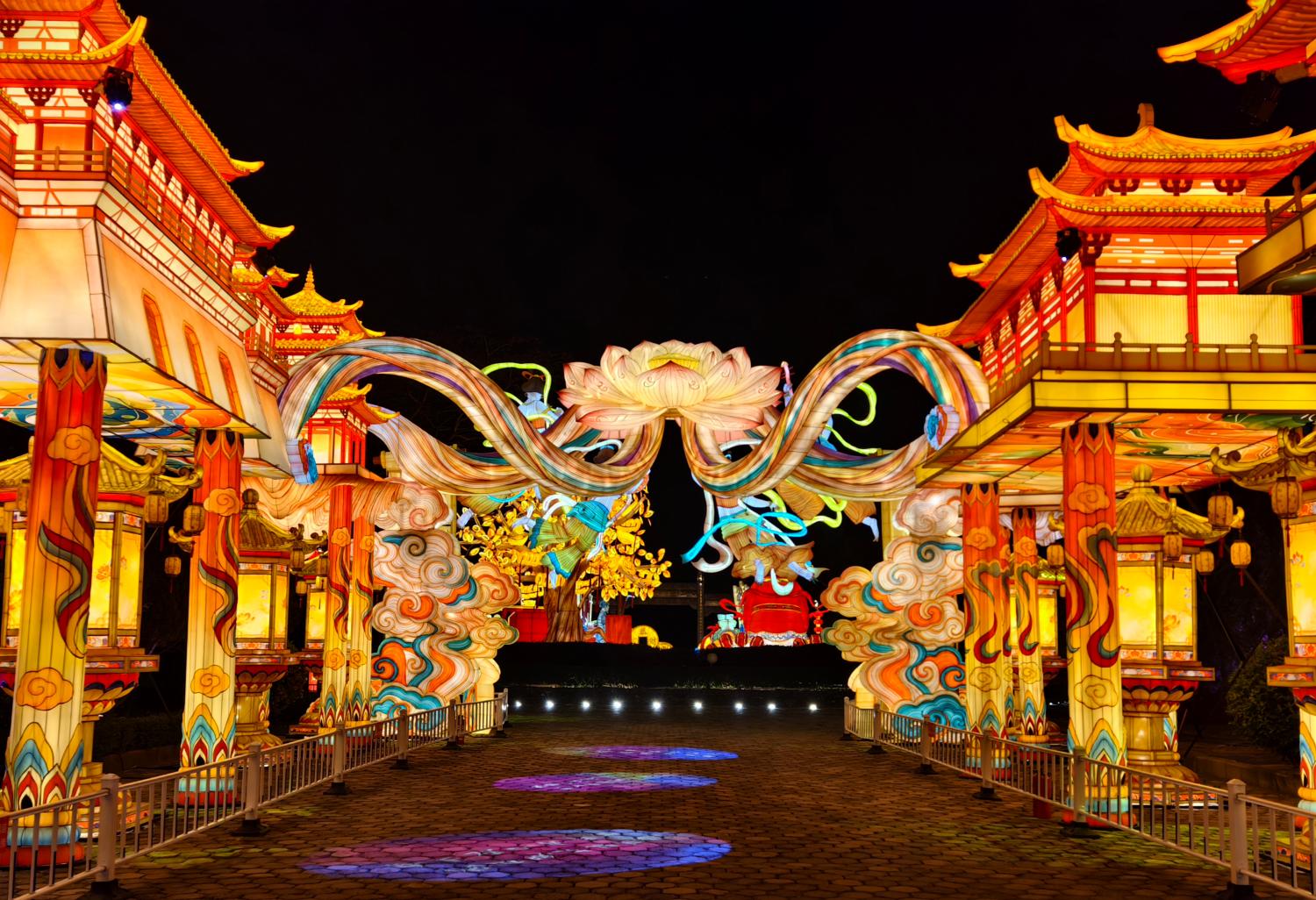
Some projects feel elevated from the first glance. Visitors slow down, look up, take out their phones, and instinctively stop in the places that matter. The venue feels organized, intentional, and memorable.
Other projects are not exactly bad. They may have many lanterns, plenty of color, and no obvious shortage of effort. Yet something still feels off. The space looks crowded but not refined, busy but not memorable, colorful but not truly atmospheric. People may walk through, but they do not stay long, and they do not leave with one image they cannot forget.
So the difference is not always the budget itself.
Very often, the real difference is this: where the budget was spent.
Many Projects Do Not Look Premium Because They Try to Do Too Much at Once
This is one of the most common problems in lantern festival planning.
Clients are often afraid that the final result will not feel “worth it,” so the instinctive response is to add more:
- a larger entrance,
- a denser corridor,
- more fill-in pieces,
- more nodes,
- more colors,
- more lantern groups.
On paper, that can sound safe. More often feels like better value.
But lantern festivals are not warehouse displays. Filling a site does not automatically create quality. In fact, many projects that feel cheap have exactly this problem: everything wants to be important at the same time.
The entrance wants to be the hero. The main lantern wants to be the hero. The pathway wants to be the hero. Even the corners are trying to compete for attention. Every node is pushing forward, and every display wants to become the center of the scene.
When that happens, the visitor no longer knows where to look. The space may feel full, but not composed. And once that composure is gone, premium atmosphere becomes much harder to achieve.
The strongest lantern festivals are usually more disciplined. They know where the visual power should go, where the background should soften, and where the audience should discover something gradually instead of being shouted at from every direction.
Premium Lantern Festivals Are Not Just Full. They Have Rhythm
Visitors do not stand at the entrance and count how many lantern groups you built. What they feel is whether the space has rhythm.
Rhythm means this:
- what they see first,
- what they notice next,
- where they naturally pause,
- where they are invited to take a photo,
- where the strongest visual impact happens,
- and where the space is allowed to breathe.
A lantern festival that feels premium usually has emotional pacing. It does not try to keep every meter equally loud. It gives the eye moments of release, then rebuilds anticipation, then presents a stronger node exactly where it should matter most.
Projects that feel cheap often fail here. They are not necessarily underfunded. They are simply overfilled and undercomposed. Everything is equally bright, equally dense, and equally demanding. The result is not excitement. It is fatigue.
What People Remember Is Usually Not Quantity, But the One Scene That Truly Lands
This is another point many buyers underestimate.
Some of the least efficient lantern festival budgets are the ones that spread money too evenly across too many “similar” pieces. The result is a project where everything exists, but nothing truly stands out.
Visitors do not remember every corner equally. What they remember is usually:
- the first impression at the entrance,
- the main centerpiece,
- the one photo scene worth sharing,
- or the one image that represents the whole event.
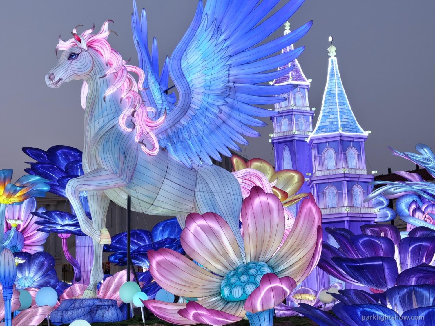
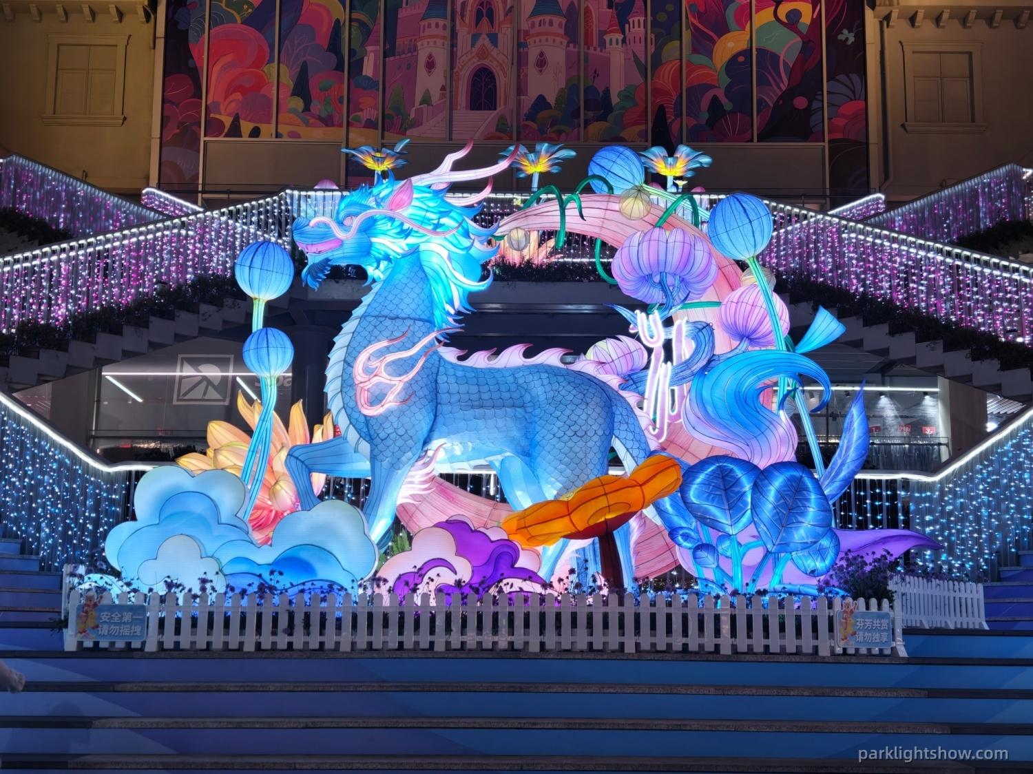
This is why some projects feel premium. Not because every square meter is complex, but because the budget was concentrated where it could create a real memory point.
When the entrance is strong, the main lantern has weight, and the most shareable scene truly lands, the whole project feels more valuable.
When everything is average, the result is often the opposite: many pieces, but nothing memorable.
Too Many Colors Do Not Create Luxury. Control Does
Many lantern festivals that feel cheap have another common issue: the color palette is uncontrolled.
Every color wants to win. Red wants more brightness, purple wants more attention, blue becomes harsher, green refuses to step back, and gold wants to sparkle even more. Each scene may look acceptable on its own, but when everything is placed together in the same night space, the project starts to feel noisy.
Premium lantern festivals are not always limited in color. But they are controlled.
They know the main color story, the supporting tones, where warmth should lead, where contrast should soften, and where light should create atmosphere instead of visual shouting.
This matters even more at night, because lighting amplifies visual stimulation. Something that feels merely busy on paper can feel chaotic in real space once illuminated.
So the real difference is not how many colors were used. It is whether those colors feel like they belong to the same language.
Some Projects Look Fine from a Distance but Collapse Up Close
This is one of the clearest sources of cheapness in lantern festival work.
From far away, a project may appear acceptable. The scale is there. The lights are on. The color is visible. But as soon as visitors get close enough to photograph details, the weaknesses begin to show:
- stiff lines,
- rough floral or pattern treatment,
- unnatural faces,
- wrinkled fabric surfaces,
- flat paint layers,
- messy finishing edges,
- and poor day-to-night consistency.
These things are often invisible in renderings. But they become painfully obvious in real visitor photos. That is why premium projects are not only built to look good from afar. They are built to hold up when people walk closer, pause, and raise their phones.
Visitors will not use technical words to describe this. But they will react instantly. They either feel that the scene is worth approaching, worth photographing, and worth sharing, or they do not.
What Makes a Lantern Festival Feel Premium Is Not Just Craft. It Is Site Understanding
Lantern quality alone does not create premium atmosphere. A lantern festival also has to fit the site.
Some projects look cheap not because the lanterns are bad in isolation, but because they were placed without enough understanding of the venue. The scale is wrong. The route is wrong. The density is wrong. The atmosphere fights the architecture instead of supporting it.
For example:
- a centerpiece may be oversized and crush the space,
- a pathway may be too dense and make movement feel uncomfortable,
- a dreamy garden venue may be overloaded with aggressive colors,
- or a commercial venue may need sharper, more efficient photo nodes but gets a layout that feels flat and scattered.
This is why making lanterns is not the same thing as making a successful lantern festival project.
Premium atmosphere comes from understanding how lanterns, routes, visitor flow, photo moments, and the venue itself work together.
What Clients Really Fear Is Not Just “Ugly.” It Is Spending Money Without Getting the Feeling of Value
For many project owners, the real fear is not simply that the event will look bad.
The deeper fear is this:
- the money is spent,
- the site is built,
- but visitors do not stop,
- photos do not spread,
- the space does not feel transformed,
- and the project never quite delivers that feeling of “this was worth it.”
That is why cheapness is not just an aesthetic failure. It is often the result of too many small compromises that quietly reduce impact, atmosphere, and memory value at the same time.
A project may not fail dramatically. It may simply never become special enough.
The Biggest Risk Is Not a Small Budget. It Is Spending the Budget Too Evenly
If there is one principle that explains many underwhelming lantern festivals, it is this:
A lantern festival usually feels cheap not because the budget is too small, but because the budget was spread too evenly.
Everything gets a little attention. Everything gets a little decoration. Everything gets a little color. But nothing receives enough weight to truly define the event.
The entrance is not strong enough. The main scene is not strong enough. The route is not clear enough. The color story is not controlled enough. The details are not refined enough.
And the final result is a project that is busy everywhere, but convincing nowhere.
By contrast, the projects that feel premium are usually much clearer about where to spend. They know:
- what must become the signature image,
- what only needs to support the atmosphere,
- which areas exist for photography,
- which areas must step back,
- and where restraint is more valuable than more decoration.
The Right Question Is Not “Why Are You More Expensive?” but “Where Is the Budget Going?”
This is the real comparison clients should make.
When looking at two similar lantern festival proposals, the real question is not just who looks busier, who uses more elements, or who sounds more confident.
The better question is:
Where is the budget actually going?
Is it going into a main feature strong enough to carry the venue? Is it going into color control and atmosphere? Is it going into details that still look good close up? Is it going into photo-worthy scenes that visitors will actually remember and share?
Or is it being spread so widely that the whole project becomes visually busy but emotionally flat?
That is where the real difference usually lives.
Conclusion: Premium Lantern Festivals Are Not Always More Expensive. They Are More Intentional
Many clients assume that a lantern festival looks premium only when the budget is significantly higher.
But the more honest truth is this:
Budget matters, but how the budget is used matters even more.
A premium-looking lantern festival is not always the one with the most lantern groups, the fullest site, or the most complicated visuals. Very often, it is the one with clearer hierarchy, stronger rhythm, better control, sharper priorities, and more restraint.
A project that feels cheap is not always underfunded. In many cases, the problem is that the budget never formed a hierarchy. It never chose what truly mattered most.
At the end of the day, clients are not really buying lantern quantity, a budget sheet, or even a rendering. They are buying a result:
Will the venue feel transformed? Will visitors stop? Will the photos travel? Will the event leave behind the feeling that the visit was worth it?
So the most useful question is not:
“Why is someone else cheaper on the same budget?”
It is:
“On the same budget, can this team make the project feel more premium, more complete, more photogenic, and more worth visiting?”
If you are also comparing budget structure with overall planning logic, you may want to read our article on how much a lantern festival costs.
If your focus is route design, pacing, and scene planning, our guide on how to plan a successful park lantern show may also help.
And if you are still comparing renderings and quotations, you can also see why you should never judge a lantern festival project by renderings alone.
FAQ
Why do some lantern festivals look cheap even with a decent budget?
Because cheapness often comes from weak hierarchy, poor rhythm, uncontrolled color use, and a budget spread too evenly across too many average elements instead of focusing on the scenes that matter most.
How do you make a lantern festival look more premium on the same budget?
The key is not simply adding more lantern groups. It is strengthening the entrance, the main visual centerpiece, the most shareable photo scenes, the color story, and the overall visitor rhythm.
Does more lantern quantity make a festival look better?
Not necessarily. More lantern groups can make a site feel crowded rather than premium if the project lacks hierarchy and pacing. In many cases, a clearer composition creates a much stronger result.
What makes a lantern festival feel premium?
Premium lantern festivals usually have stronger visual hierarchy, better rhythm, controlled colors, stronger details, better site fit, and one or two signature scenes that visitors remember and photograph.
What makes a lantern festival feel cluttered?
Clutter usually comes from too many competing focal points, too much density, too many uncontrolled colors, and a lack of visual breathing space.
Should more of the budget go into the main lantern display?
Very often, yes. A project is usually remembered through a few key images, not through every small lantern group equally. Strong main scenes often create more value than spreading the budget too evenly.
Why is color control so important in lantern festival design?
Because night lighting amplifies visual stimulation. Without color control, a project can quickly feel noisy or cheap, even if the individual lanterns are not bad on their own.
Do details really matter if visitors mostly see the festival from far away?
Yes. Visitors may first notice the festival from a distance, but the real judgment often happens up close when they stop, walk through, and take photos.
Can a lantern festival still look expensive without increasing the budget?
Yes. Many projects look more expensive not because they cost more, but because the budget is used more intentionally, with stronger focus on hierarchy, atmosphere, and memory points.
What should buyers compare besides price in a lantern festival proposal?
They should compare where the budget is going, how strong the main scenes are, whether the color and route are well controlled, how refined the details are, and whether the project truly fits the venue.
Post time: Apr-14-2026


